A color never exists on its own in a room. What you actually see is three things at once: the pigment, the light falling on it, and the surface it sits on. Change any one of them and the “same” color turns into a different one.
That’s why a chip that looked perfect in the store can look gray, green or flat on the wall. It isn’t bad luck. The chip was judged under different light, on a different surface, at a tiny size. So here is how I think about choosing interior colors: start from a system, then check the color against the light and the textures it will actually live with.
Start with a color system, not a swatch
A color system gives every color an address. That matters for two reasons: everyone on the project (client, designer, painter, supplier) talks about exactly the same color, and you can move through a palette on purpose instead of by feel. The ones you’ll meet most often:
- NCS (Natural Color System). Describes a color the way people perceive it. A code like S 1050-Y90R means 10% blackness, 50% chromaticness (strength), and a hue of yellow with 90% red. It’s great for building calm, related palettes, because you can keep blackness and strength fixed and change only the hue.
- Munsell. Splits color into hue, value (lightness, 0–10) and chroma (saturation). Thinking in these three separate dials is the most useful habit in color selection, whatever system you end up specifying in.
- RAL. The standard for coatings, metals and manufactured finishes, with four-digit codes such as RAL 9010 (pure white). Useful when window frames, metalwork or furniture have to match paint.
- Paint-brand fan decks. Benjamin Moore, Sherwin-Williams and others have their own codes. Each color also lists an LRV (light reflectance value) from 0 (black) to 100 (perfect white). Most whites sit in the 80s and low 90s. LRV is the fastest way to know how light or dark a color will really read on a wall.
Build the palette in the right order
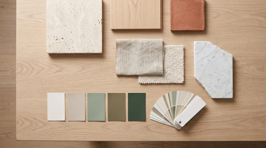
Most palettes go wrong because hue gets chosen first. I work in this order instead:
- Fixed materials first. Flooring, stone, tile, brick, cabinetry. You can repaint a wall in a day; you can’t repaint a marble slab. Pull the paint colors from the materials, not the other way round.
- Value next. Decide the light-and-dark structure of the room: which surfaces are lightest, which are darkest, and how much contrast there is between them. LRV makes this concrete.
- Then hue and chroma. Keep large surfaces low in chroma and let smaller elements carry the stronger colors. The old 60-30-10 split (a dominant color, a secondary one, and an accent) is a fine starting point, not a rule.
- Check undertones. Whites and grays are never neutral. Put samples next to a sheet of plain printer paper and the warm (yellow, pink) or cool (blue, green) undertone shows up immediately.
Light changes every color
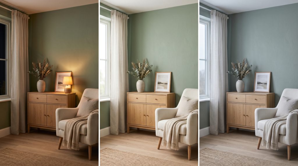
This is the part people underestimate most. The same wall can look like three different colors across a day.
Color temperature
Artificial light is described by its color temperature in kelvin (K). Around 2700K is warm and cozy, 3000K is a warm white, 3500–4000K is neutral, and 5000K and up looks like cool daylight. Warm light flatters reds, woods and warm whites but pushes blues and cool grays toward muddy or green. Cool light does the opposite and can make a creamy white look dull. Pick one color temperature per room and keep it consistent across fixtures, or the walls will change color from lamp to lamp.
Color rendering
Color rendering index (CRI) tells you how faithfully a light source shows colors, on a scale up to 100. For interiors, aim for CRI 90 or higher. It’s also worth checking the R9 value, which measures saturated reds: low R9 is why wood, skin and red fabrics can look gray under cheap LEDs. Some manufacturers also publish TM-30 figures, a newer and more detailed measure.
Daylight
In the northern hemisphere, north-facing rooms get soft, indirect, cooler light that makes colors look grayer and slightly blue. South-facing rooms get strong, warm light that brightens colors and can wash out pale ones. East- and west-facing rooms swing between the two over the day. Choose a color for the light the room really gets at the time it’s used most.
Metamerism
Two samples can match perfectly under one light and not under another. It’s called metamerism, and it’s the reason a paint matched to a fabric in the store can drift apart at home. Always compare finishes under the actual lighting of the room.
Texture changes color too
The surface is the third ingredient, and it matters as much as the pigment.
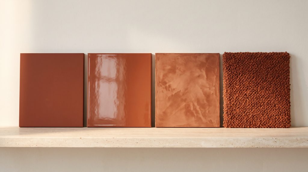
- Sheen. The same paint looks lighter and softer in matte, because the rough surface scatters a little white light back at you. In satin or gloss it looks deeper and more saturated, but it also picks up reflections of windows and fixtures. Decide the sheen together with the color, never after.
- Textured finishes. Limewash, plaster, bouclé, rough stone and brushed wood are full of tiny shadows, so they read darker and richer than a flat chip of the same color. Grazing light from a window or a wall washer exaggerates the effect.
- Materials with their own variation. Wood grain, terrazzo and veined stone already contain several colors. Picking paint and fabric colors out of them is the easiest way to make a room feel connected.
- Tone on tone. A quiet, low-contrast palette needs texture to stay alive. Linen next to plaster next to oak in similar values feels layered; the same colors all in flat paint feel dead.
Where 3D visualization helps, and where it doesn’t
A good 3D model lets you test all three ingredients together before anything is bought. The lights can be set to their real color temperature and position, the sun can be placed for the actual orientation and time of day, and materials carry their real roughness and reflectivity, so a matte plaster and a satin paint behave differently, as they would on site. Comparing two or three palettes side by side, in the same room and the same light, makes decisions much easier. Kitchens are where this pays off most, because cabinets, counters and floors all meet in one room. I go through that case in kitchen remodel 3D rendering.
The honest limit: screens aren’t calibrated, and no render replaces a physical sample. I use visualization to narrow the choice down to one or two options, then confirm them with real samples in the real room.
A short checklist
- Collect the fixed materials and photograph them in the room’s light.
- Choose a color system and write down codes and LRVs, not names.
- Set the value structure first, then hue and chroma.
- Decide the lighting: one color temperature per room, CRI 90+ (and a decent R9).
- Paint large samples, about 2 × 2 ft, on more than one wall and look at them morning, afternoon and evening, with the lights on.
- Judge color and sheen together, on the real surface.
- Compare the shortlisted options in a 3D visualization, then confirm with physical samples.
If you’re choosing colors and materials for a project, I can build the room in 3D with your real lighting and finishes so you can compare options before you paint. The services page shows what each project includes, or get in touch for a free estimate.